
Retail
Gymshark Case Study
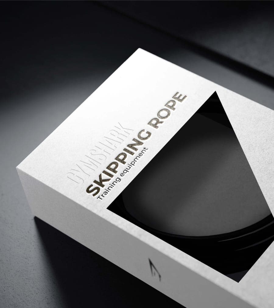
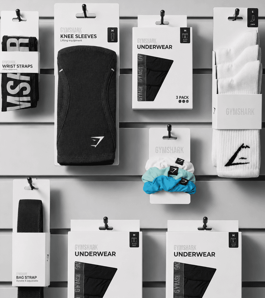
We partnered with Gymshark to organise a complex network of packaging, trims, labels and product information into one connected global resource. The result gives internal teams, suppliers and manufacturers the clarity they need to work efficiently, consistently and creatively.
View Project